Lost Connections Follow Up
#research #datamining #manual #statistics #truthseeker
Geographic Discrimination Follow-Up Report
Thanks for your interest in the previous interest in the “Craig’s List Connections Project”. Some people might be curious about what the numbers like that in the “undisclosed” cohort. Here’s some follow up after some sessions of data cleaning and spreadsheet enhancement.
In my opinion there are three types of reports in the “undisclosed” cohort. The cohorts are based on the type of write-up. The first cohort is “Consumer Reports”. These reports indicate the report is written by a non-medical professional friend or family member. There are 15 reports from this cohort. The research method was able to extract location data from 1 report of this cohort. The second cohort is CDC-Split Manufacturer reports. There 1,026 reports from this cohort. 452 reports are from Jansen. 170 reports are from Moderna. 401 reports are from Pfizer. 1 report is from USSA. The research method was able to extract location data from 2 reports of this cohort. The third cohort is Write-Ups of Medical Professionals. This includes but is not limited to caregivers, first response, doctors, nurses and medical writers. There are 2,921 reports in this cohort.
The research documented 3,960 reports from the “Unknown” location. According to www.medalerts.org there are 3,946 fatality reports from the “Unknown” location cohort for the week ending 10/14/2022. The data was updated. The total reports were 3,960. During this project removed reports were not actively monitored or tracked. After the initial analysis a new column was added in order to search a location by its actual location(A), Removed ( R ), Theoretical (T) or Unsolved (U) status. The project was able to generate 1,970 theoretical location matches from the “Unknown” location cohort. 1 report was from the Consumer Write-Up cohort. 2 reports were from the CDC-Split Manufacturer cohort. 1,967 reports were from the Write-Ups of Medical Professionals.
According to the new spreadsheet there are 1,989 reports in the (U) cohort and 1,970 in the (T). The total is 3,959. Somewhere 1 report has an error data entry. The research is ongoing and subject to revision in the future. There are some write-up clusters that can use further research.
The research method consisted of highlighting potential matches from the (A) cohort and (U) cohort to generate the (T) cohort. Initially some matches stood out in the (U) cohort. The location was highlighted with the color, Brick, and the Write-up was highlighted with the color “Dark Green 2”. In the case of Tennessee reports from the (A) cohort I placed a “Lime Green” highlight in the write up. The remaining (U) cohort was given a “Light Red 2” highlight in the “Location” and “Write-Up” columns.
Both cohorts were combined into one spreadsheet. The results were searched by “Write-Up”. The method for Tennessee yielded results. Some more matches were generated using the “Light Red 2” method.
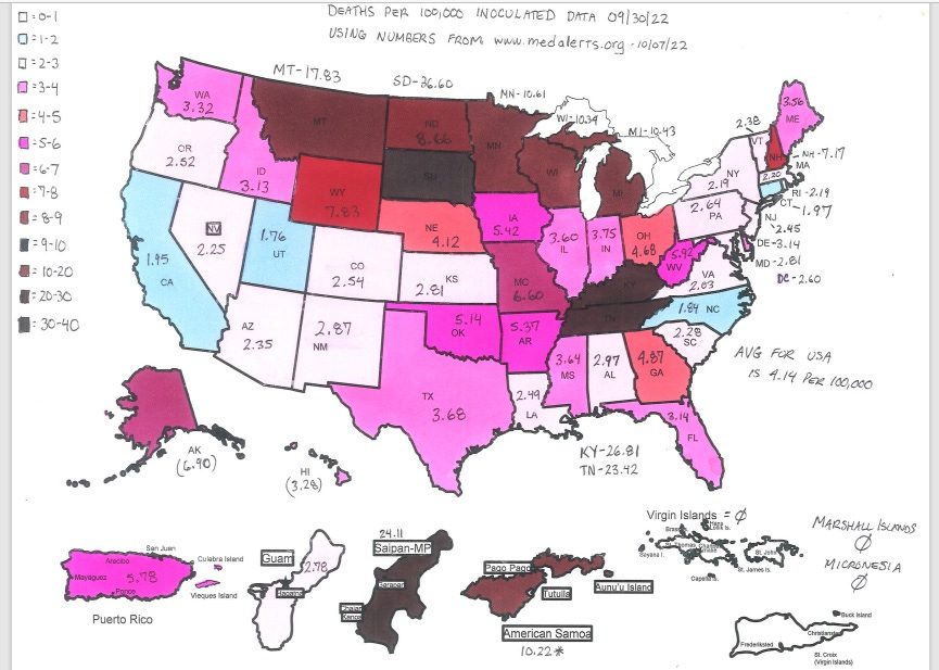
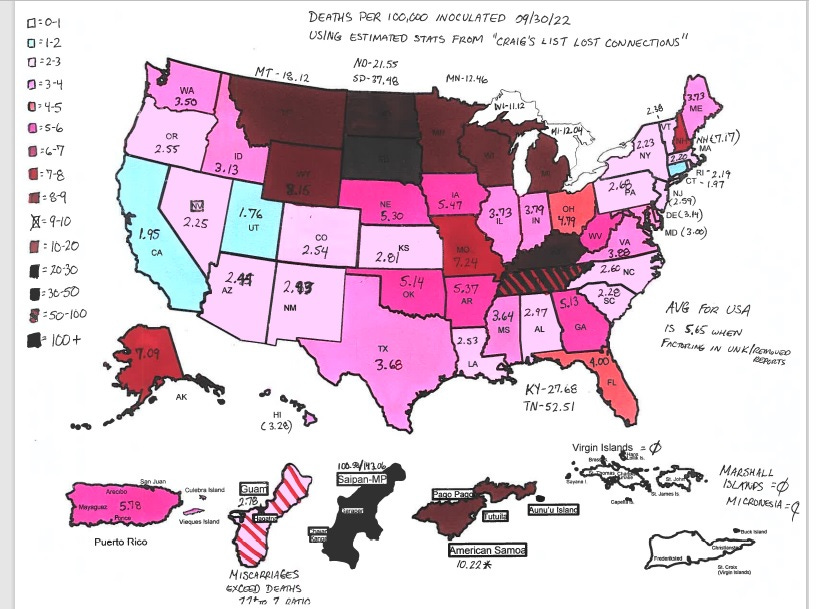
After incorporating the (T) cohort into the (A) cohort a new estimate for Death Per 100,000 Inoculated was produced. Heat map illustrations were produced in order to get a visual. The first heat map is using the numbers from the week ending 09/30/2022 from the website, www.medalerts.org. Older data from www.ourwolrdindata.org was used. The number of people “vaccinated” per state goes until about mid June 2022. An updated version of the previous spreadsheet data could not be located. It’s my opinion that an insignificant number of people transitioned from “unvaccinated” to “vaccinated” from June 2022 to present.
Here’s the "Craig’s List Lost Connections” heat map.
Thank you for reading. Thank you sharing. Thank you for being uninoculated moving forward.


